In this post, I explain how I made the logo for the ggchameleon package using nothing but R!
Author
Aaron Graybill
Published
November 17, 2023
Introduction
I’m the author of the ggchameleon R package. While making this package, I learned a great deal about how to massage ggplot2 charts to automatically display a customized “brand” (font, colors, layout, etc.). I also learned about how to do math to colors to make sure that gradients look normal to humans. Humans are weird, so the math to represent our color vision is equally weird. When I made the logo for this package, both of those two skills proved to rather useful. In this post, I’m going to walk through how I constructed that logo in a fully reproducible way using R.
Stylistic Constraints
If you look at the logos for various R packages, you’ll find that they tend to follow the format exemplified here. From those exemplars, I decided that my logo should:
Fit in a hexagon with a notable border
Have the name of the package clearly visible
Have a minimalist, geometric image representing a package
From these constraints, a natural choice is use a chameleon as the primary image. However, I am not an artist, so I needed a way to convert an existing image into a minimalist, geometric representation of a chameleon.
The input image
Wikipedia is a subsidiary of the Wikimedia Foundation. The Wikimedia Foundation does much more than just run Wikipedia, but pertinent now is the Wikimedia Commons which hosts media (images, videos, sounds, etc.) for free, for the public benefit. When you see an image on a Wikipedia article, you are likely viewing an image hosted on the Wikimedia Commons.
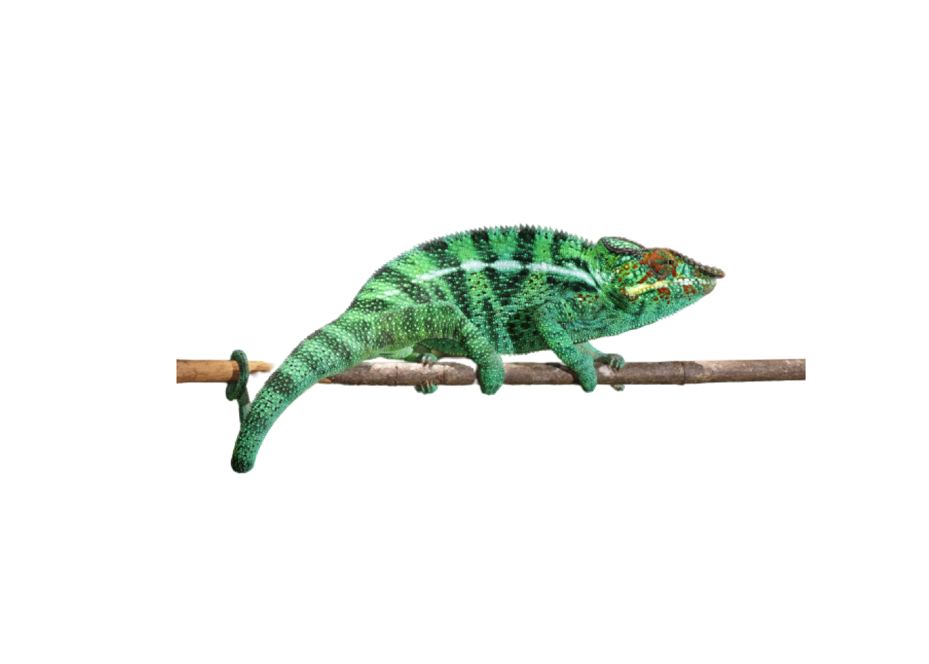
The other wonderful upside of the Wikimedia Commons is that many of the images are given the Creative Commons License which means that users can freely adapt these images to their own uses (even commercial!). In my case, I selected this incredible image of a chameleon as the base for my logo:
The base image for my logo, by Charles Sharp
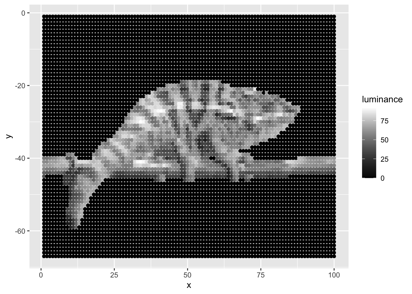
Removing the image background using R
The input image has a background that has beautiful bokeh, but the rectangular shape of the image fits awkwardly into our hexagonal box. Let’s remove the background of the image so that we only have the chameleon and the stick he’s perched on. There may be ways to do this in R, but it’s much simpler and more effective to outsource this task to a dedicated service. Thankfully, we can tell R to access such a service directly through an API. In particular, I use the free API available at remove.bg. This service works perfectly but requires you to use an API key (so that they know who you are when you send a request). In general, it is bad practice to publicly share your API key, so the following code has the API key hidden in a private file. Substituting readLines('bg_api_key') with a string like "my_cool_api_key" should make the code work as expected.
The status code 200 indicates that our request has been processed successfully. When our request is successful, the API returns binary data encoding the png image that we can write to our local machine for further processing. I do that as follows:
out <-content(result)png::writePNG(out,'chameleon.png')library(magick)chameleon <-image_read('chameleon.png')plot(chameleon)
You can see that the API did an excellent job of removing the background from the image! Onto the next task…
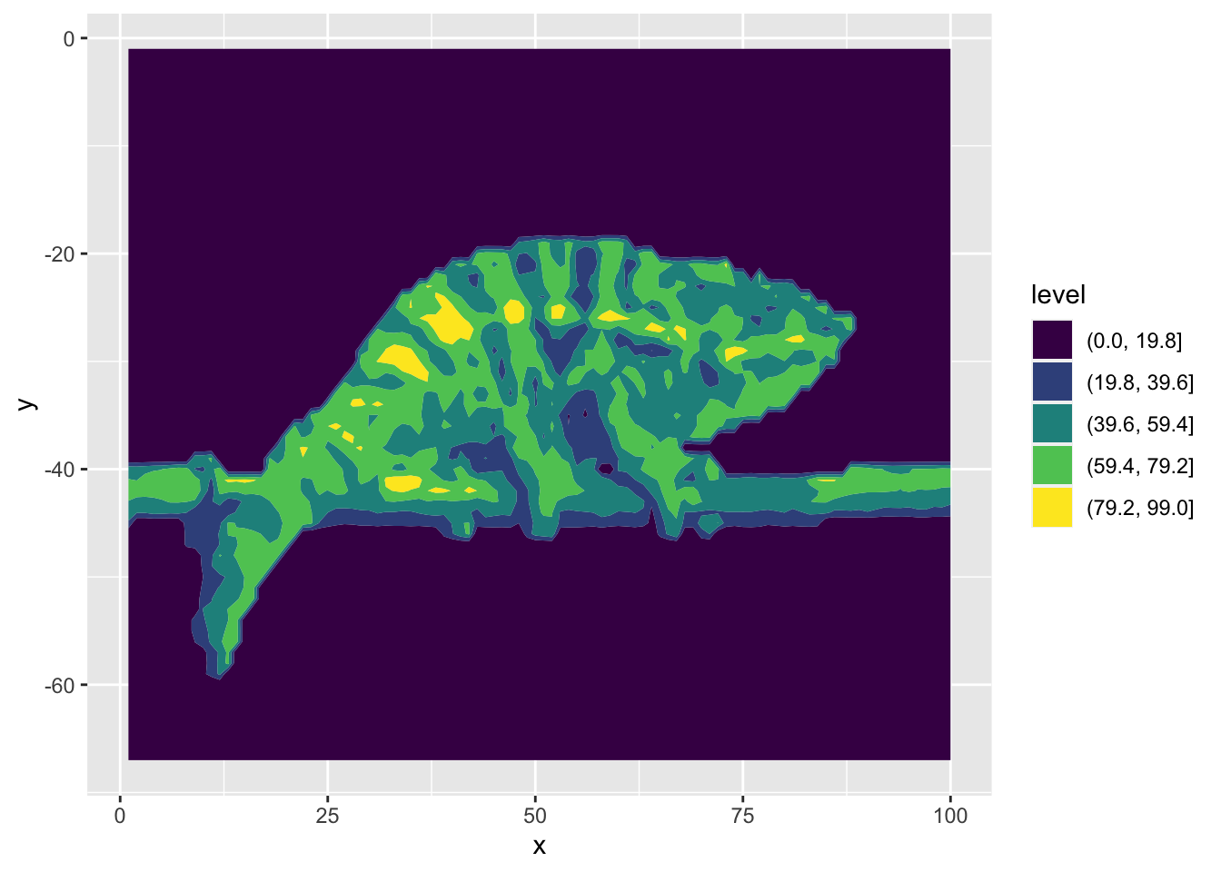
Converting the image to a geometric design
The image above is still rather intricate (chameleons are beautifully intricate creatures), but one our goals was to simplify the image into a simpler set of geometric shapes. To do this, I had the idea to take the brightness of each pixel and treat that as a value that I could put into a contour map. A contour map is often used to visualize changes in elevation, as shown below in the underwater mountain Resolution Guyot:
An example of a contour map by Balon Greyjoy
In the above example, redder areas indicate higher regions, and bluer areas indicate lower regions. You can tell that the contour map is able to convert the complex surface of the mountain into a series of simpler geometric shapes. I use this idea by treating pixel brightness as the “height”.
I admit, the code becomes a bit complicated here, so I have “folded” it so as not to clutter this post, but here’s an outline of what the code does:
Compute Brightness
# Make the image smaller and extract the pixel level informationdf <-image_data(image_scale(chameleon,"100"))# The pixel data is a 3D array (red, blue, green)# we can paste each of those channels into the standard hex color # of the format: #FF00FF# I then convert all of those hex codes into a matrix with the same dimensions# as the rescaled imagem <-paste0("#",df[1,,],df[2,,],df[3,,]) %>%matrix(nrow =dim(df)[2],ncol=dim(df)[3])# The "row" function returns the row number of every element in the matrix# we treat that row number as an x coordinate# we do a similar thing with the columns using the "col" function# we have to be careful to transpose the matrix as needed,# We use the "c" function to flatten the matrix of row numbers into a vector# and we multiply by -1 because pixels start in the top left, but when we plot# we want to start in the bottom leftoutdf <-data.frame(x =c(t(row(m))),y =-1*c(t(col(m))), hex =c(t(m)))library(dplyr)brightness_df <- outdf %>%# Convert the color to a "colorspace" that has a brightness component and# is perceptually uniform, ie a one unit increase in brightness means the# same thing for all colors# then we extract the luminance (brightness) and treat that as # the outcome variablemutate(luminance = {farver::decode_colour(hex) %>% farver::convert_colour("rgb","lab")}[,1]) %>%mutate(luminance =floor(luminance))
Rescale the image so that it’s small enough to generate simple contours
Convert the image into a data frame of each pixel’s coordinates and its color
Compute the brightness (technically luminance) of each color in the image
After we do all of that, we have a dataframe that looks like this:
brightness_df %>%head() %>% knitr::kable()
x
y
hex
luminance
1
-1
#000000
0
1
-2
#000000
0
1
-3
#000000
0
1
-4
#000000
0
1
-5
#000000
0
1
-6
#000000
0
And we can plot the luminance directly and we will see something resembling a grayscale image of our scaly friend:
That is much closer! What remains is for us to remove unnecessary elements of that plot, customize the colors, and add the design to the hexagonal tile.
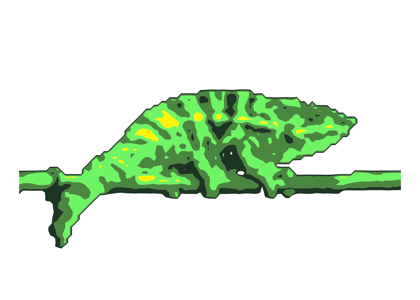
Cleaning up, Customizing, and Hexagoning
Again, I’ve “folded” the cleaning of the chart for sake of brevity, but feel free to unfold it and take a look at what manipulations are required. The result of the cleaning is the following:
Clean Chart
# Custom color schemepal <-c("#000D4D",'#26442E','#5A9550','#7DF279','#FFF200')pal[1] <-'#00000000'#Sets background color to transparent# Create cleaned-up plotp <-ggplot(brightness_df)+# make sure there are no lines between contoursgeom_contour_filled(aes(x=x,y=y,z=luminance),bins =5,linewidth=0)+# makes the image's aspect ratio true-to-lifecoord_equal()+# removes all extraneous plot info (axes, lines, etc.)theme_void()+# customize the fill colorsscale_fill_manual(values = pal)+# don't print the legendtheme(legend.position ="None")+# remove the x and y axis labelsxlab(NULL)+ylab(NULL)# Print the updated chartp
Now, we need to place our simplified chameleon onto the hexagonal tile. Thankfully, the hexSticker package makes it easy to generate these hexagonal tiles and add our own images on top. First we save a rotated version of the chameleon so that it’s parallel to the hexagon, then we overlay that saved version onto the tile generated by hexSticker. We can do that as follows:
# Save the rotated ggplot as a svg (infinite resolution)library(grid)svg("rotated_contour_chameleon.svg", bg ="#00000000")print(p, vp =viewport(angle =30))capture_output =dev.off()# Add the brand font into available fontssysfonts::font_add_google('Atkinson Hyperlegible',regular.wt =700)# Generate the Hexagon with the image on toplibrary(hexSticker)sticker("rotated_contour_chameleon.svg",package="ggchameleon", # text on the images_height= .90, # svg image sizes_width = .90,h_fill ='#000D4D', # background colorh_color ='#7DF279', # border colors_x =1.23, # location of image s_y = .8,p_x = .99, # location of textp_y =1.42, p_size =6, # font sizep_color ='#E7F6F4', # font colorp_family ='Atkinson Hyperlegible'# font family) %>%plot()
And that’s it! Feel free to remix this code with your own images. I think other animals or distinctive architecture could look interesting, but I’d be interested to see what else can be done using these techniques.
_male_Nosy_Be.jpg#file)